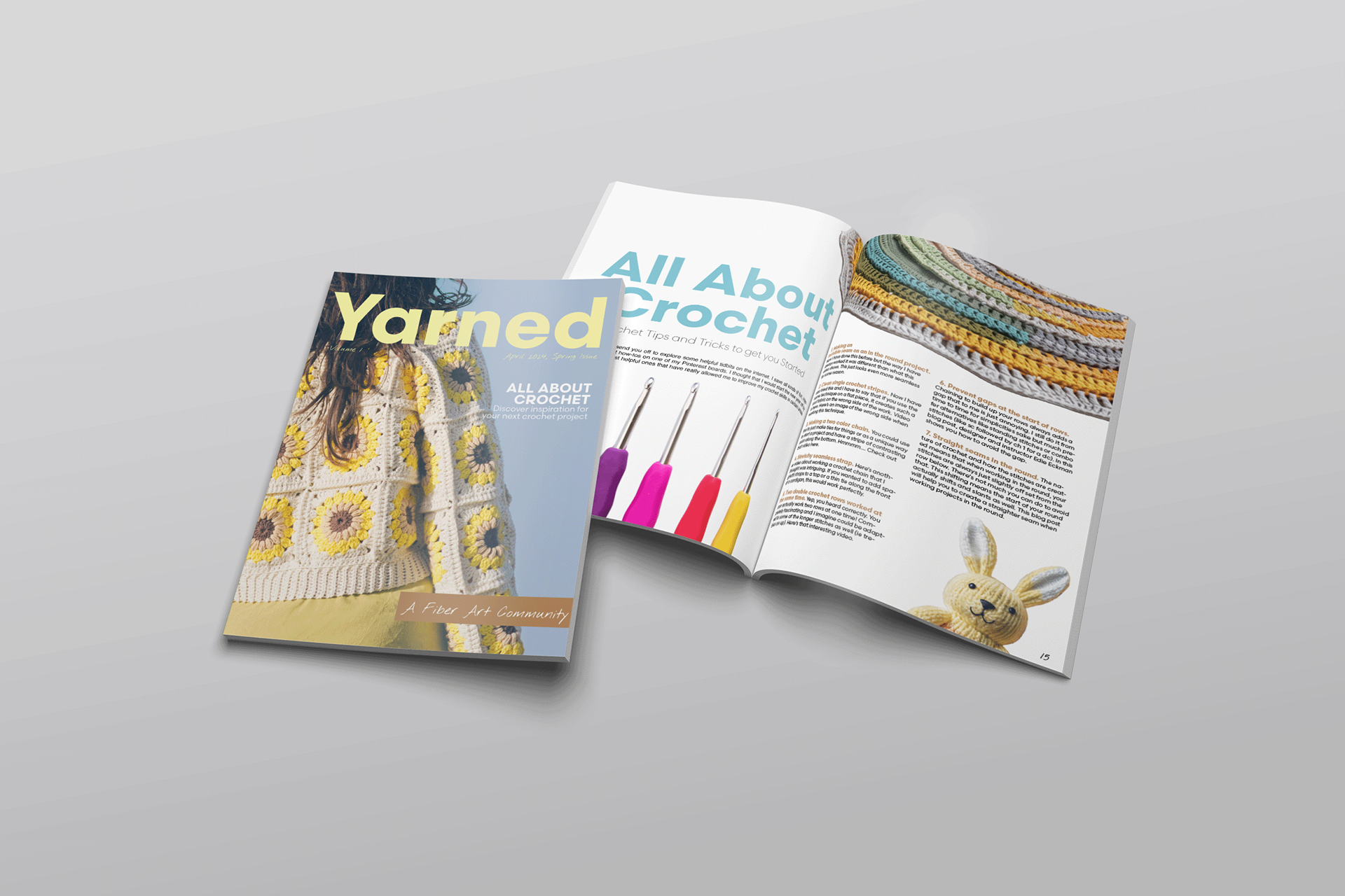
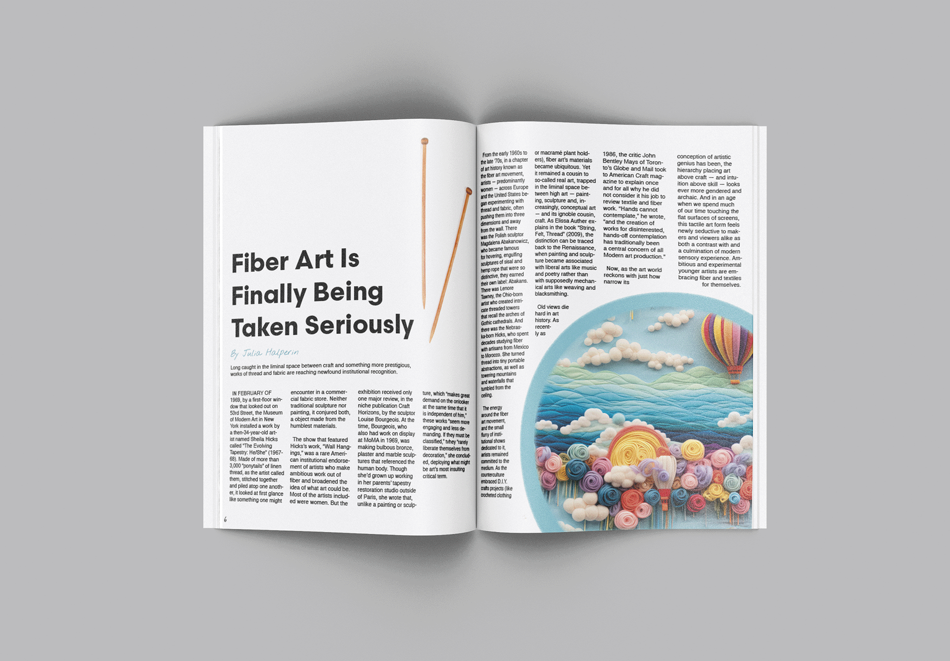
YARNED is a fibre arts magazine designed with the intention of minimal typography and maximum visual impact. The magazine showcases art from a wide range of creators, as well as tools used for fibre arts. My deliverables were for a print magazine.
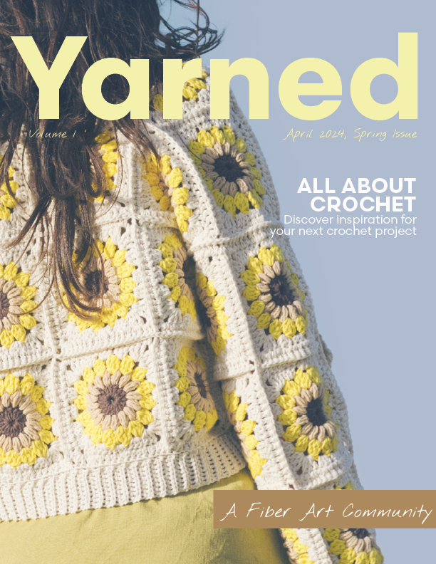

I wanted the colour palette to have a relaxed, toned down feel as most of the photography in the magazine is bright and colourful. I chose brown, teal, yellow and pink displayed throughout. The brown and teal give the magazine a down-to-earth feel that I was looking for, and the yellow and pink draw more attention. I chose Helvetica (bold) as the typeface for headings, Nothing You Could Do (regular) as secondary text for headings, and Helvatica (regular) for the body type. I used a mixture of centre, left and right alignment throughout the magazine.
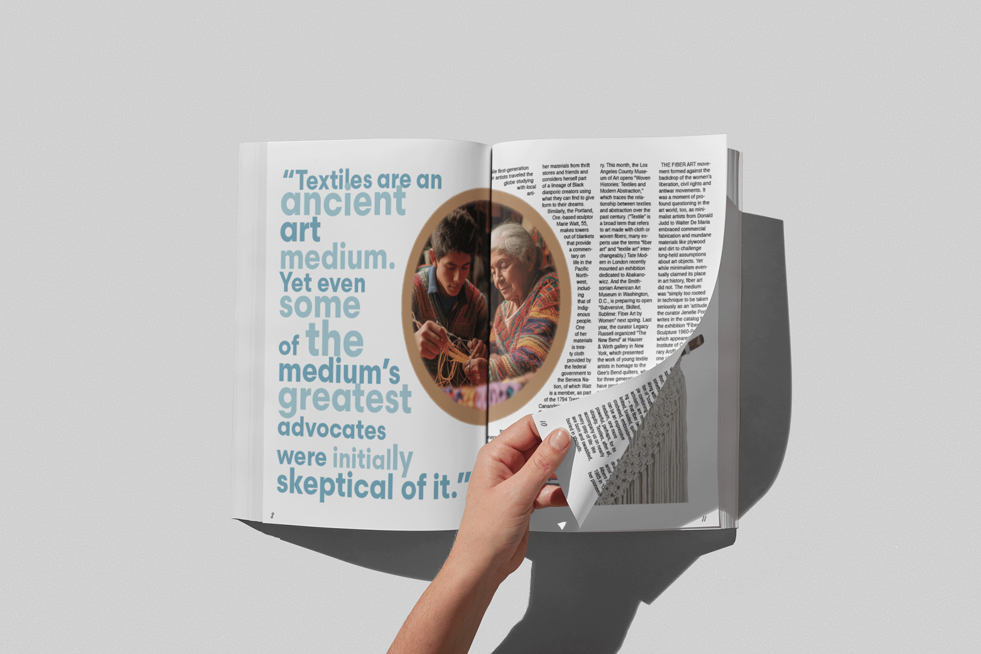
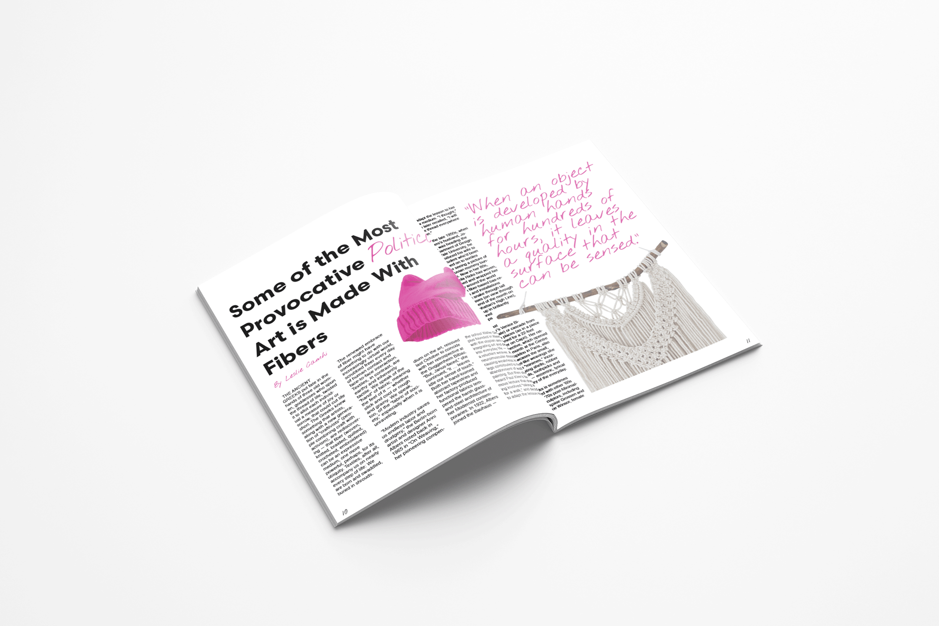
I brought the tone of the images down to create a relaxed feel, even amongst the vibrant colours.
If I were to make changes to this project for next time, I would spend more time planning out the layout of the magazine. Brainstorming and sketching are such important steps in the process, and I feel like for this project I started creating in Adobe Indesign too quickly before developing a solid plan with sketch work. I would also work on the text- wrap, and how the article type fit with the photos. Some type is not reader-friendly as there are too many hyphens.
I used Adobe Indesign, and Photoshop for this project.