

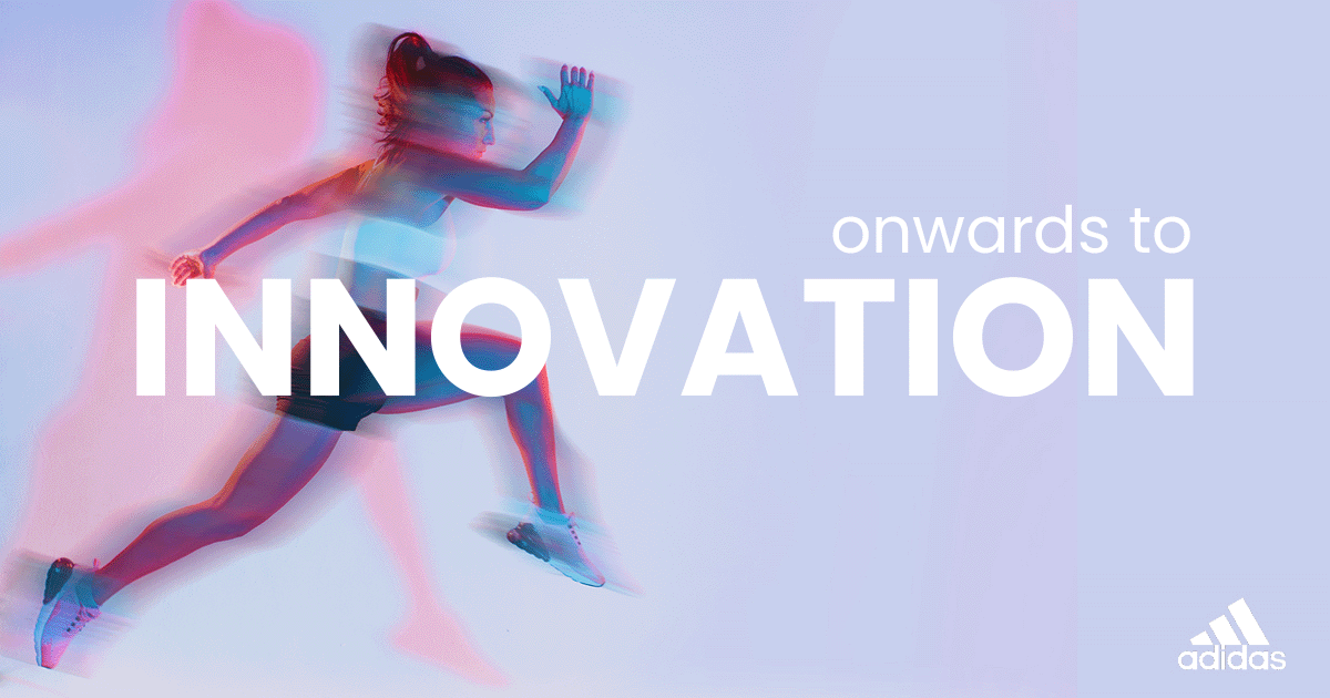
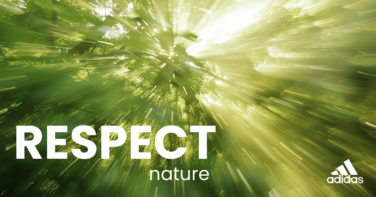
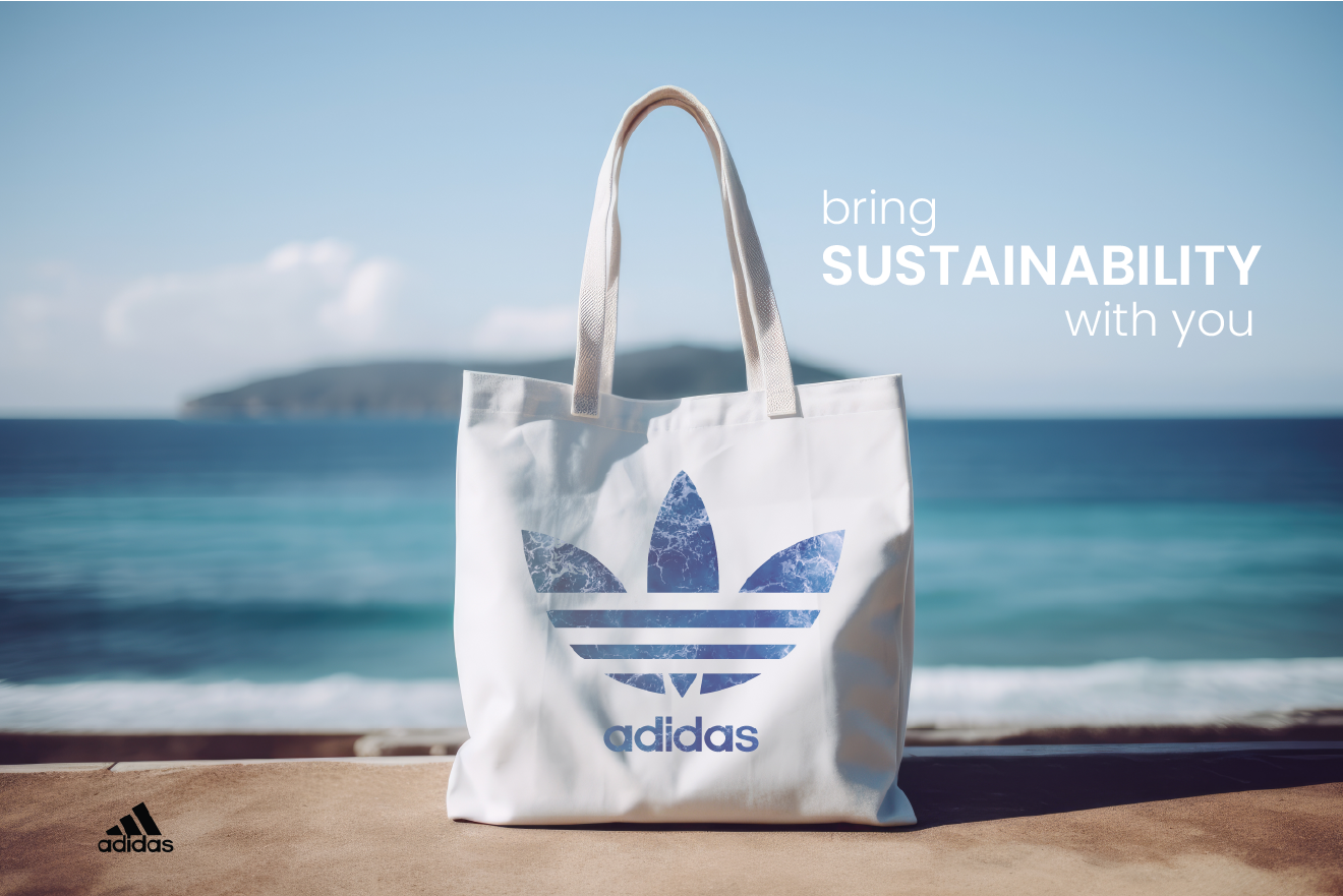
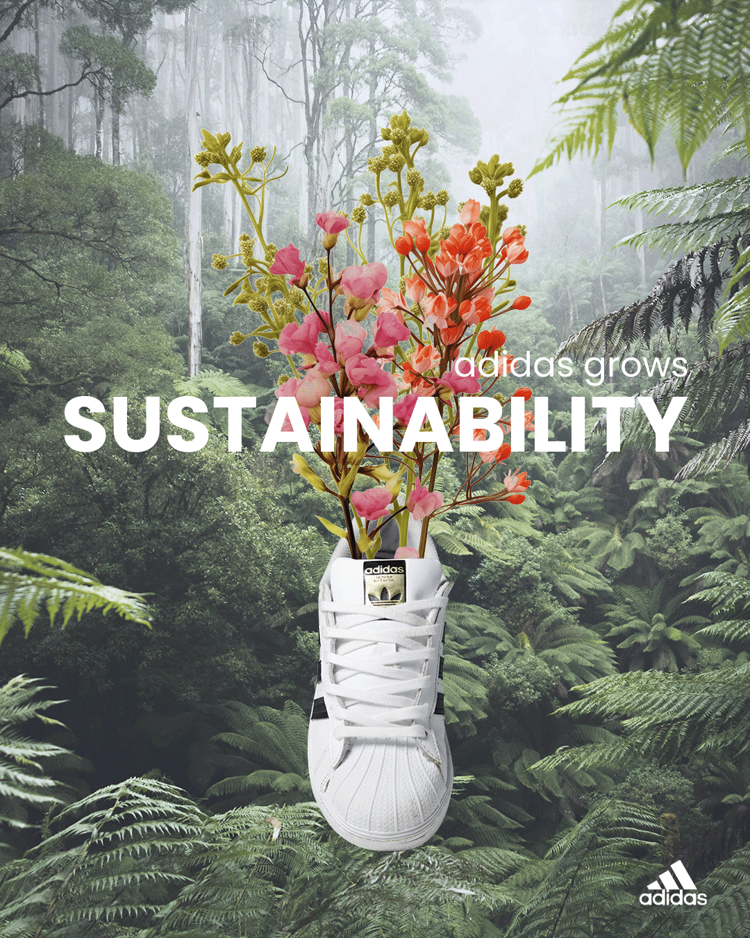
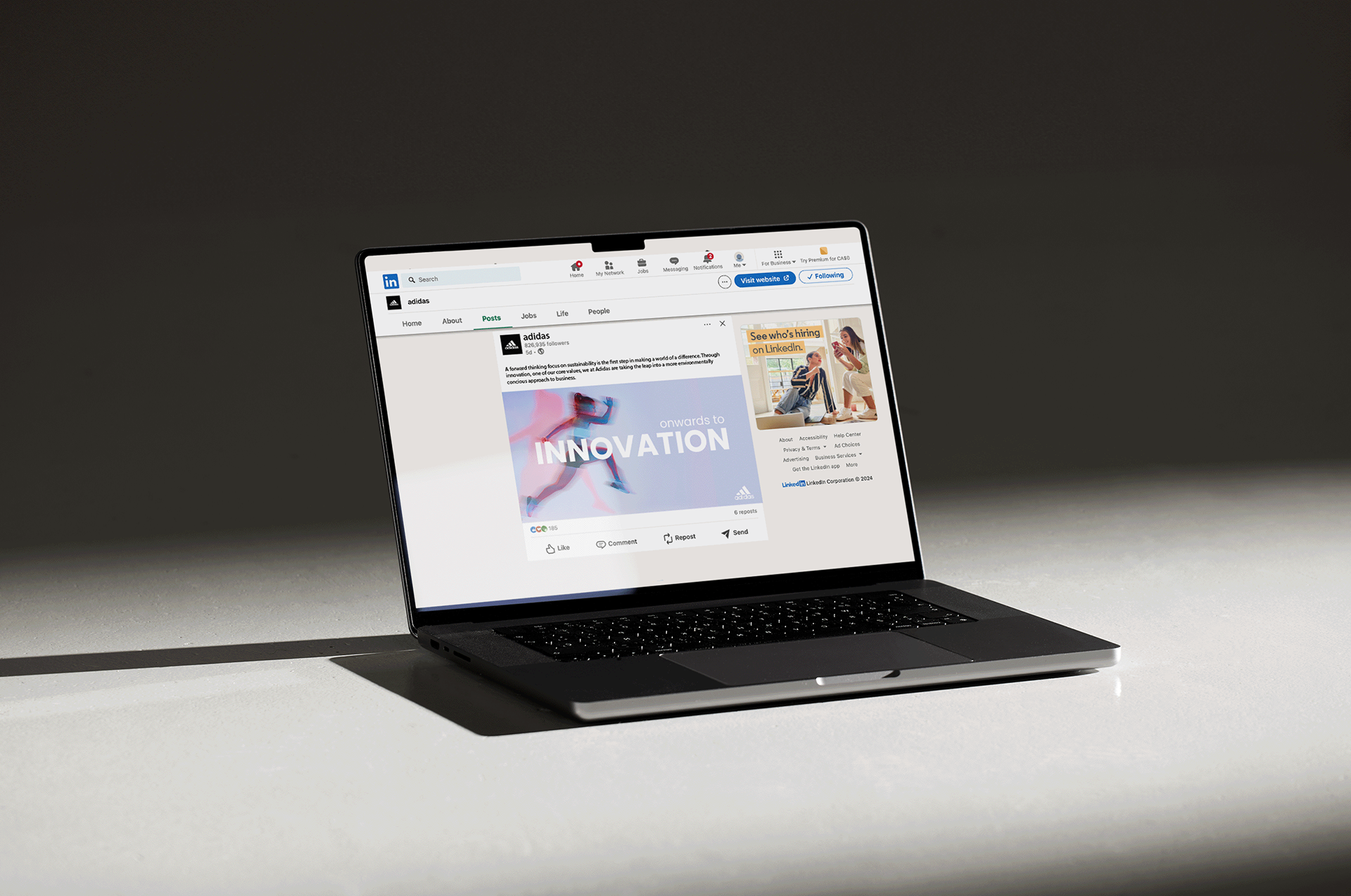
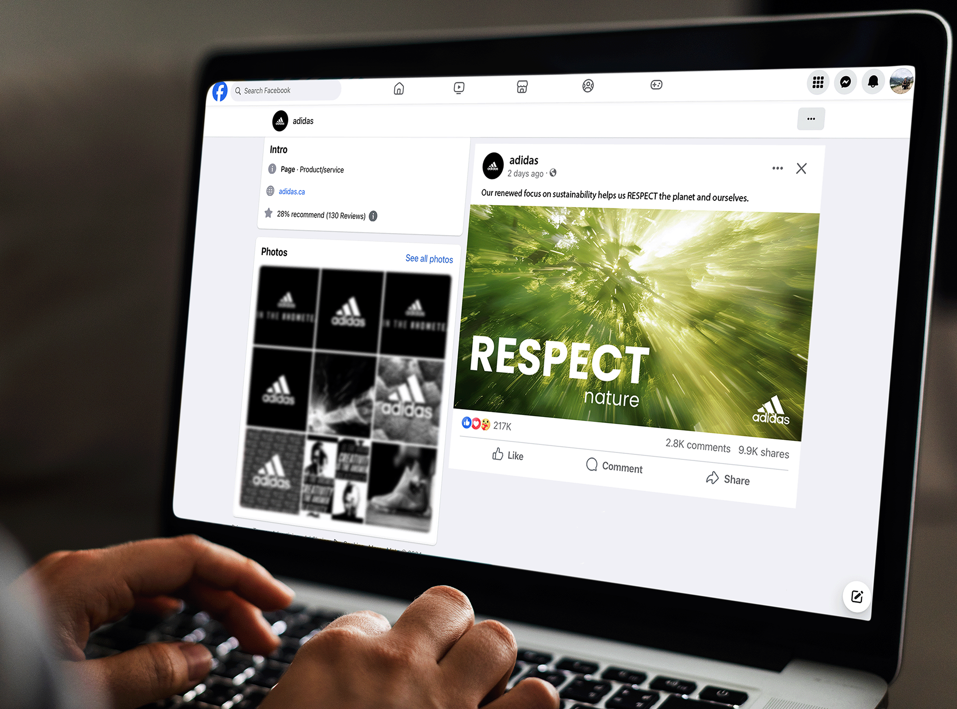
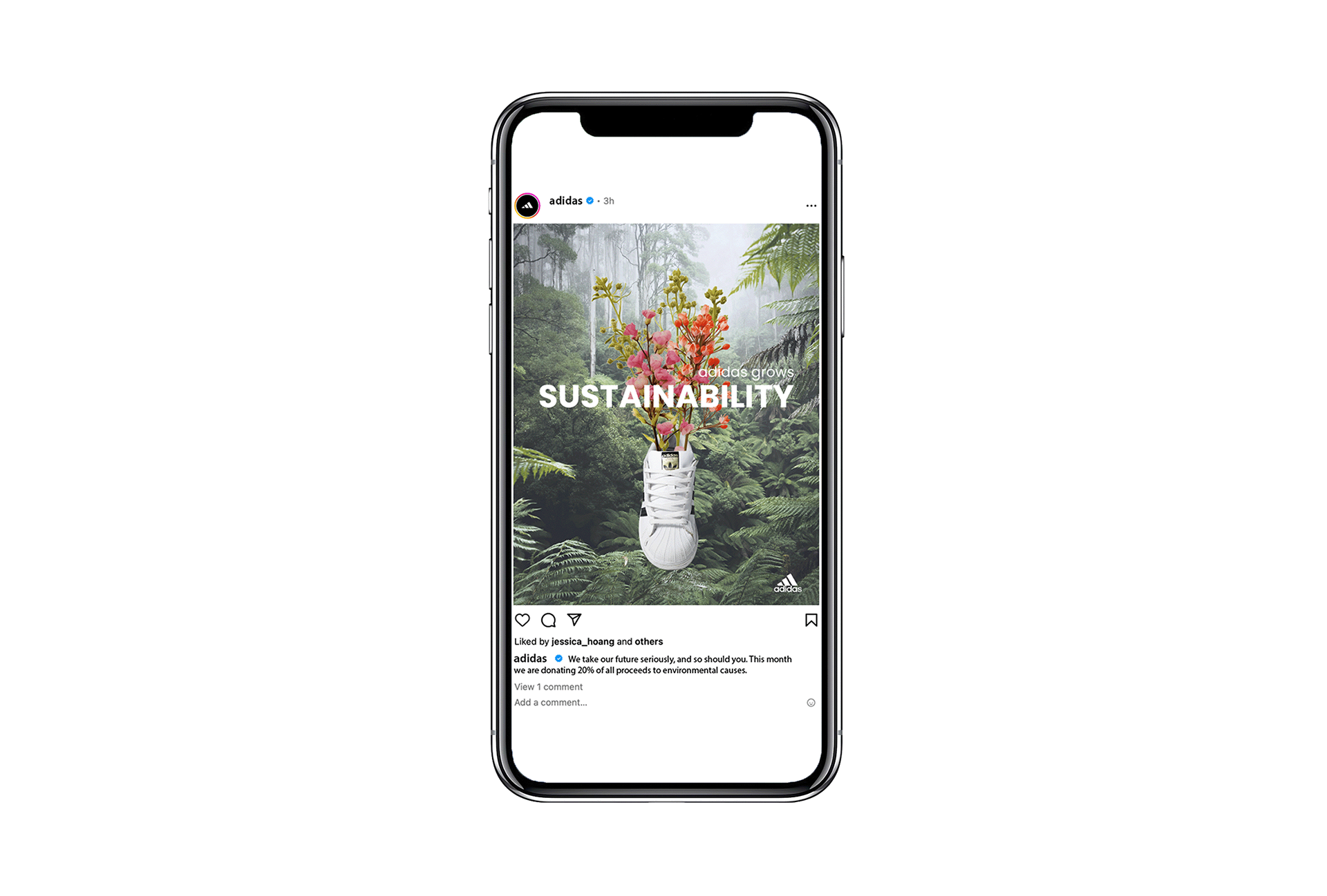
The idea of this project was to design different marketing materials for Adidas’s 2024 sustainability report campaign. I created various touch points and social media posts to go along with the sustainability theme and included the brands values heavily throughout the pieces.
After researching Adidas, I learned the type of typography they used, their hierarchy, and the types of visuals and colours they most commonly used. I incorporated these aspects into each piece to carry over the same expectation and aesthetic from the brand. I combined different font weights and sizes, as well as clear photos, and photos with extreme blur. I used mainly cool colours and sans-serif typeface Poppins (bold and regular). I noticed from researching Adidas that they would use a combination of all caps, bold, and low caps. They also often used images with blur. These aspects were important to me to incorporate into my pieces because it helps them feel like they are part of an Adidas advertising campaign. The blur help you feel the physical movement. The wording is directly correlated to their brand values, and this fictional sustainability report.
I used Adobe Illustrator, Indesign, and Photoshop for this project.
